Blog / Guest blog / How to... / Journalists / PR Tips
Beyond 300 DPI – digital image tips for publishers
ResponseSource is committed to making life easier for journalists and their sources. One topic that comes up again and again is around images – too big or too small; too many or too few; too simple, too snazzy. We’ve provided tips on images for PR professionals in the past (see also here and here), but images can bamboozle journalists too. This guest post from Juli Greenwood, director of communications at image and video management platform Cloudinary, offers some guidelines for journalists to take the the stress out of sourcing and specifying images.
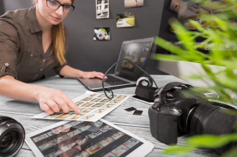
You know it all too well. You finally finished off that big feature article and just need to source some images to go with it. You’ve asked your PR contact for three images, at least ‘300 DPI’ , then it all went quiet…
While most cameras and phones produce images in 300+ DPI (dots per inch), as soon as people share them on WhatsApp, Instagram and other channels they are automatically reformatted to 72 DPI or lower in order to save space. When your PR contact goes quiet, he or she is often frantically trying to hunt down the original, un-reformatted images. But do you really need 300 DPI images?
If they’re photographs going into print media, the answer is likely yes. But DPI alone is meaningless without accounting for a picture’s format and dimensions (cover photo or postage stamp?). DPI is irrelevant for infographics, charts and other vector, or line drawings, whose resolution doesn’t change with resizing. With digital publishing, DPI (or PPI – pixels per inch) can usually be much lower and, again, only applies to photographs.
In working with prolific digital publishers like BuzzFeed, Conde Nast and CNN, we’ve tackled almost every image management issue out there. Here are six points to consider ‘beyond 300 DPI’:
1. GIF and JPEG are reliable old standbys
If your site doesn’t use a system that adapts image file formats to readers’ browsers or mobile displays, ask for GIF or JPEG files. The two, however, are not interchangeable. GIF is ideal for brand logos and line-art with simple colour palettes. One advantage of GIFs is that they don’t lose detail when compressed – so compression won’t change a brand’s colour. JPEG was designed – and is the best choice of the two – for photographs. JPEGs do, however, lose a little quality when compressed.
2. Consider new formats like HEIF
If your readers are Apple users, ask for HEIF files. This format uses modern compression techniques, providing high definition and flexibility in a small package. HEIF also allows for 3D, animation and other special effects, and supports a very wide colour spectrum. Google’s WebP format offers similar advantages and is supported by most browsers (though some require an extension).
3. Bigger can be worse
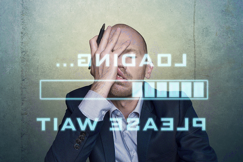
When people have to wait for images to load, they often give up and move on. In fact, research shows you have just three seconds or less before that happens. Smaller files load much faster than large ones, so unless you know your readers are using very high end kit, it’s better to err on the side of small. 72 PPI and files sizes measured in KB rather than MB will usually suffice.
4. Crop wisely
When images are resized in a window or on mobile formats, the result can be unflattering if cropped in the wrong place. Cloudinary customer StubHub wrote this Medium article warning of unwittingly making Billy Idol’s armpit the focus of an image!
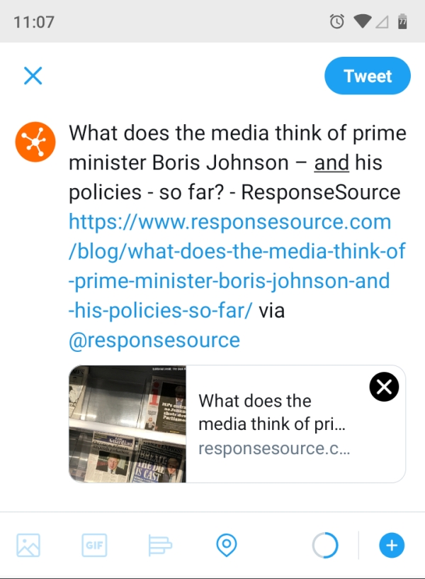
5. Ask for an extra ‘link unfurl’ image
The link unfurl image is the picture that’s shown with shared links in Slack, WhatsApp, Messenger and other messaging services. More people are sharing articles on these platforms so it’s important for the unfurl image (and the accompanying text) to be compelling. We strongly advise publishers against using their ‘hero image’ which is too generic and can make shared links look spammy or unprofessional.
6. Consider a media management solution
Now that people read and view content through so many different browsers and devices, it’s worth looking at a media management system. Most importantly, these give publishers the flexibility to use new, improved and smaller file formats knowing they will be automatically adapting for any readers’ environment. Some provide smart auto-cropping (see point 4) and other dynamic image manipulation that would otherwise require a lot of hand coding.
As a spec, 300 DPI at least had the advantage of being simple. However, in digital publishing, there is more flexibility, more options and therefore greater opportunity to use images to both sell and tell your stories.
Guest post by Juli Greenwood, director of communications, Cloudinary
Armed with these tips for sourcing images, why not request photos, infographics and illustrations to support your stories on the free Journalist Enquiry Service? Just go to responsesource.com/send and fill out the form, selecting “Images / video / audio” in the “Looking for:” section.

Subscribe to the blog
Get weekly updates from the ResponseSource blog